The problem
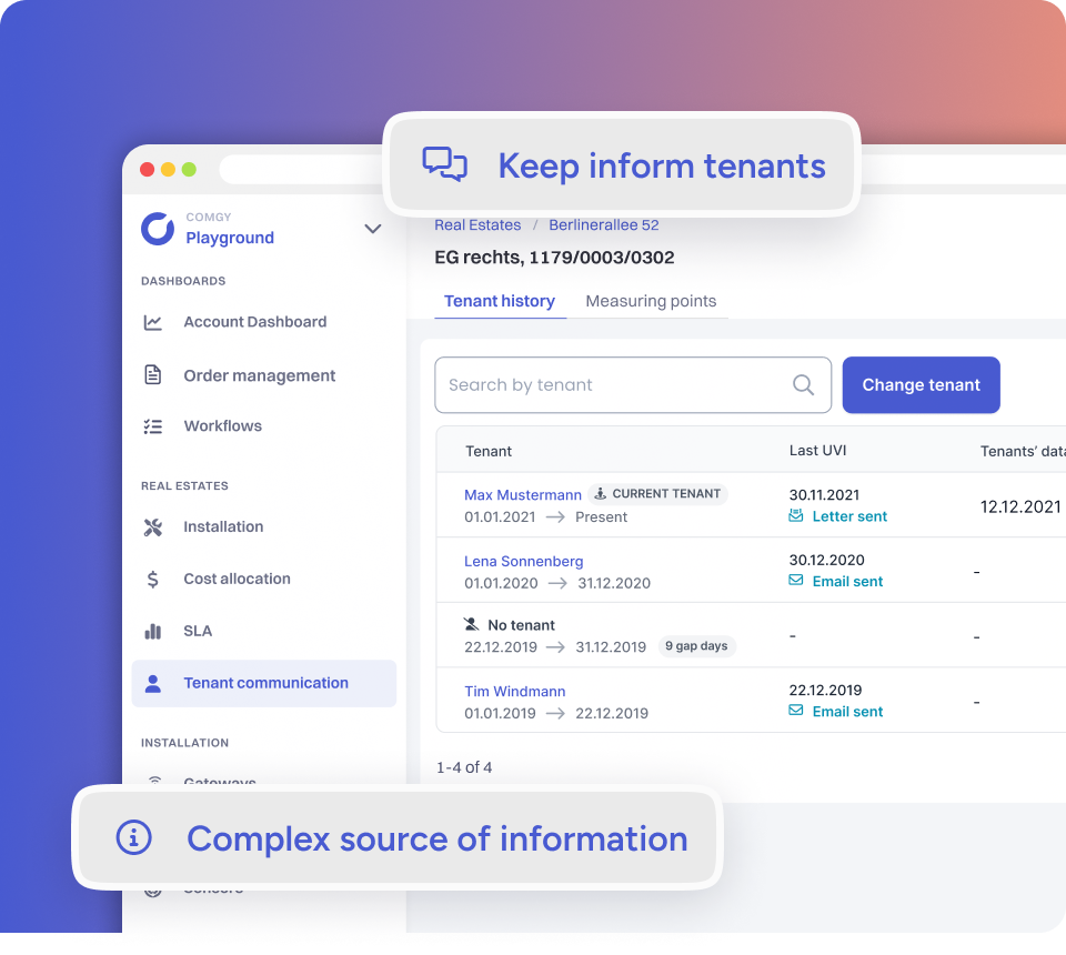
Managers need to keep data up to date and send tenants consumption information. Across many apartments it was easy to get lost: it wasn't clear whether to edit the current tenant or add a new one, and installer abbreviations were mixed with manager actions.
Understanding the task, not the screen
With the product manager I reviewed the existing solution and user reports. I wrote a simple persona, a problem canvas and user stories, then compared the old and new flows on a real task: move a tenant out of a specific apartment.
One primary action
The apartment level got a primary "Change tenant" button. Users no longer need to remember whether it's a move-in or a move-out, because the system picks the right form.
Fewer pointless questions
The wizard hides questions that don't apply to the process and shows important values as read-only. Finishing a move-out no longer forces you to add the next tenant, and the notification says who replaced whom.
The result
- 11 of 11
- test users found the option
- 8+
- six-week cycles with different teams
What stayed in the organisation
Beyond the flow itself, we introduced UX standards such as user flows and user tests. Working with a different team every six weeks also taught me to adapt quickly to new requirements.